 how-to
How to Choose Unique Wall Art: A 2026 Guide
Table of Contents
- Start With Your Story: How to Choose Unique Wall Art That Feels Like You
- Unique Wall Art Ideas That Go Beyond the Big-Box Store
- The Wall Art Size Guide: Getting Scale and Proportion Right
- How to Create a Gallery Wall Without It Looking Cluttered
- Match Art to Your Room and Existing Color Palette
- Where to Find Genuinely Distinctive Art (and How to Spot a Fake)
- Hanging, Lighting, and Rental-Friendly Installation Tips
- Conclusion: Making the Final Call on Your Unique Wall Art
- Frequently Asked Questions
Last Updated: October 12, 2026
Start With Your Story: How to Choose Unique Wall Art That Feels Like You
Most people buy wall art backwards. They scroll a marketplace, spot something that looks nice, and hope it fits their space.
Learning how to choose unique wall art starts somewhere else entirely: with your story.
Unique wall art is artwork chosen for personal meaning, not availability. It reflects your taste, your humor, or a memory, rather than whatever a big-box store stocked this season.
So before you browse anything, answer three questions:
- What do you want the room to say about you?
- Which colors already live in that space?
- What mood should the art create when you walk in?
Write your answers down. They become your filter for everything else.
Unique Wall Art Ideas That Go Beyond the Big-Box Store
Big-box stores sell the same fifty prints to everyone in your zip code. That's fine for a hotel lobby. It's a problem for a home.
Here's where genuinely distinctive art comes from:
- Personal photography. A photo you took, printed large and framed well, beats any mass-produced landscape.
- Humorous statement pieces. A print that makes guests laugh does more for a room than one that blends in.
- AI-assisted designs. Tools can turn a specific, oddball idea into a finished graphic you won't find on a shelf.
The thread connecting all five: each one starts with a decision only you would make. That's the difference between decor and a statement.
The Wall Art Size Guide: Getting Scale and Proportion Right
The right artwork size depends on the wall and the furniture beneath it, not the frame you fell in love with. Most people buy too small, then wonder why the room feels unfinished.
Use this guide before you buy:
| Wall or Furniture Width | Art Width | Common Mistake |
|---|---|---|
| Sofa 180 cm | 120-135 cm total | Buying one 40 cm print |
| Console 120 cm | 80-90 cm total | Hanging art wider than the console |
| Queen bed 150 cm | 100-120 cm above headboard | Centering too high |
| Narrow hallway wall | 50-70 cm | One tiny frame on a long wall |
A simple rule: art should cover about two-thirds to three-quarters of the furniture width below it. Hang the center of the piece at eye level, roughly 145-150 cm from the floor.
Measure twice. Buy once.
How to Create a Gallery Wall Without It Looking Cluttered
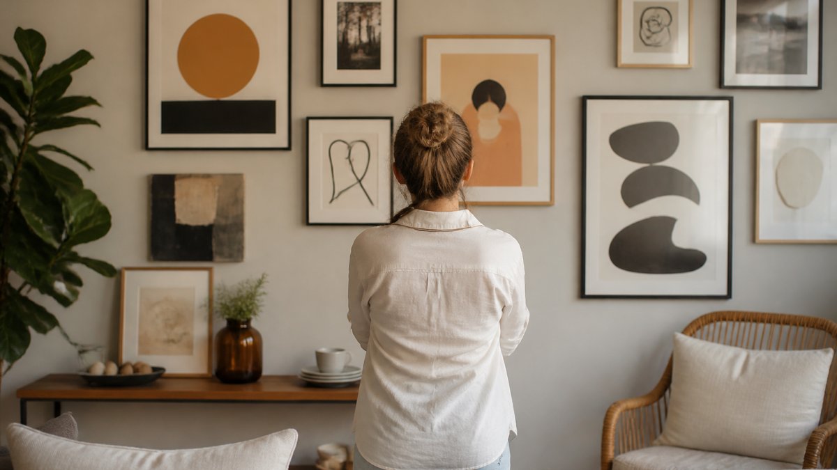
A gallery wall works when it has a spine. Pick one anchor piece, then build around it with a consistent gap of 5-8 cm between frames.
Cluttered gallery walls almost always share the same flaws:
- No clear focal point
- Random spacing between frames
- Too many competing frame styles
Fix it with a simple plan:
- Lay every frame on the floor first and arrange until it looks right.
- Trace each frame onto paper and tape the paper to the wall.
- Step back and check the balance before you hammer anything.
- Hang the anchor piece first, then work outward.
- Keep frame gaps equal, even if sizes differ.
Match Art to Your Room and Existing Color Palette
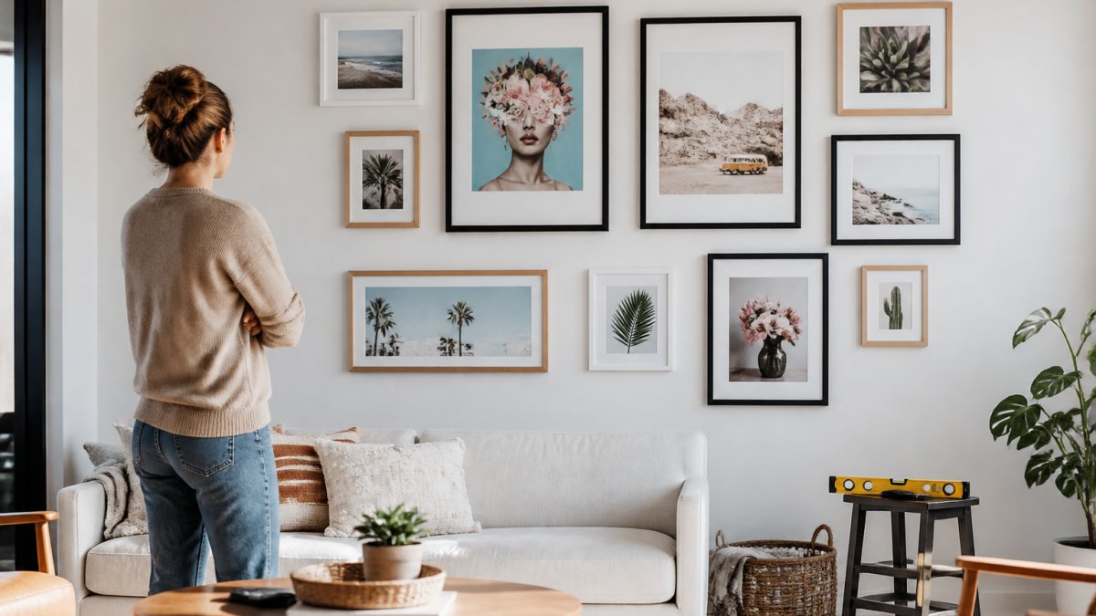
Your room already has a color palette, whether you planned it or not. Pull two or three colors from your furniture, rug, or curtains, and let those guide your art choices.
Three approaches work well:
- Match: repeat a dominant room color in the art for a calm, cohesive feel.
- Contrast: pick a color opposite your palette to make the art pop.
- Bridge: choose art with two room colors plus one accent to tie everything together.
For a living room, larger statement pieces suit the space. For a bedroom, softer tones and personal pieces work better. A nursery can handle bright, playful graphics. A kitchen or bathroom does best with durable materials that handle humidity.
Where to Find Genuinely Distinctive Art (and How to Spot a Fake)
Original work hides in plain sight once you know where to look.
Where to look, and what each channel is good for:
- Local art fairs and craft markets. Best for meeting the maker, asking about materials, and buying a one-off. Prices range from affordable prints to original canvases, and you can often negotiate on the last day of a fair.
- Student and emerging-artist shows. Best for original work at lower prices. Ask whether the piece is a study or a finished work, and whether the artist plans to edition it later.
- Estate sales and vintage shops. Best for frames, mid-century prints, and one-of-a-kind pieces with history. Inspect for foxing (brown spots), water stains, and brittle paper before buying.
How to spot a mass-produced print dressed up as original:
- The same design appears on five different shops under different brand names.
- Product photos look identical across sellers, often with the same mockup room.
- The listing has no artist name, no story, and no edition number.
- Reviews mention fading prints, peeling edges, or colors that don't match the photos.
Ask one question before buying: can I find this exact design anywhere else? If the answer is yes, it isn't unique.
Budget, provenance, and quality without a luxury price tag:
Set a range before you browse. A useful way to think about it:
- Under $50: open-edition prints, posters, and small digital reproductions. Fine for rentals, dorm rooms, and rotating displays.
- $50-$200: limited-edition prints, signed reproductions, and small originals from emerging artists. This is the sweet spot for most homes.
- $200-$800: original paintings, drawings, and mixed-media pieces from working artists. Ask for a certificate of authenticity if the artist offers one.
- $800+: established artists, larger originals, and commissioned work. Expect provenance documentation and a written condition report.
Provenance simply means the piece's history: who made it, when, and how it changed hands.
Quality checks you can do in person or from good photos:
- Paper: cotton rag and archival papers feel heavier and won't yellow as fast as cheap newsprint.
- Ink: pigment inks resist fading better than dye-based inks.
- Frame: solid wood or metal beats plastic; acid-free mats prevent burn marks on the art.
- Signature: a pencil signature and edition number (like 12/50) signal a limited run.
A well-made print in a simple frame often beats an expensive frame around a weak design. Spend on the art first, the frame second, and the mat third.
Hanging, Lighting, and Rental-Friendly Installation Tips
Good hanging hardware and the right light do more for your art than an expensive frame. Get these basics right and even a modest piece looks intentional. This section covers the measurements, materials, and rental-safe methods that most guides skip.
Hanging height and spacing formulas:
- Center height: Hang the center of the artwork at 145-150 cm (57-59 inches) from the floor. This is the standard gallery height and works for most rooms.
- Above furniture: Leave 15-25 cm (6-10 inches) between the bottom of the frame and the top of the sofa, console, or headboard.
- Gallery wall gaps: Keep 5-8 cm (2-3 inches) between frames. Equal gaps matter more than equal frame sizes.
- Art-to-furniture width: Art should cover about two-thirds to three-quarters of the furniture width below it.
Hardware and weight limits:
- Under 2 kg (4.4 lbs): A single nail or adhesive strip is usually enough.
- 2-10 kg (4.4-22 lbs): Use two hooks spaced a few centimeters apart, or a French cleat for wider pieces.
- Over 10 kg (22 lbs): Drive screws into a stud or use heavy-duty wall anchors rated for at least twice the frame's weight.
- Plaster walls: Use self-drilling anchors; standard plastic plugs can crumble the plaster.
Always use two hooks per frame for stability. One hook lets the frame tilt every time a door closes.
Lighting and glare:
- Avoid direct sunlight. UV light fades pigment and paper over time. If a wall gets strong afternoon sun, rotate the piece or use UV-filtering glazing.
- Angle light across the surface. A picture light or adjustable lamp positioned at 30-45 degrees cuts glare better than light aimed straight at the art.
- Warm bulbs (2700-3000K) make most artwork look richer than cool white (4000K+).
- Glazing matters. Glass and acrylic both protect art, but acrylic is lighter and safer for large pieces. Museum glass reduces glare and UV but costs more.
Rental-friendly installation and damage prevention:
- Adhesive strips: Use strips rated for at least twice the frame's weight. Clean the wall with rubbing alcohol first and let it dry.
- Test first: Apply a strip to a hidden patch of wall, wait 24 hours, then remove it to check for paint damage.
- Removal: Warm the adhesive with a hairdryer on low, then pull the strip slowly downward, not outward. This protects the paint.
- Weight limits: Adhesive strips work well for frames under about 2 kg. For heavier pieces, use a single small nail or a removable picture hanger that leaves a pinhole.
Conclusion: Making the Final Call on Your Unique Wall Art
The hardest part isn't finding art. It's trusting your own taste when the options are endless.
If you want pieces that skip the big-box aisle entirely, Popmakesyousmile creates humorous, expressive designs using AI tools across home decor and accessories. Every item is made to order through a professional production network, so you're not choosing from a warehouse shelf. Start with one piece that makes you smile, then build the wall around it.
Frequently Asked Questions
What is the 3-5-7 rule in decorating?
The 3-5-7 rule is a styling guideline for grouping odd numbers of objects, such as three, five, or seven items, on a shelf or wall. Odd numbers create visual balance because the eye can't pair them symmetrically, which makes the arrangement feel more dynamic. For a gallery wall, this could mean five framed prints in varying sizes. It's a starting point, not a hard rule, so adjust based on your wall space and the scale of each piece.
How do I choose wall art that reflects my personality?
Start with what you already love. Look at your favorite colors, the places you've traveled, or the hobbies you talk about most. If you're drawn to humor, a bold graphic or a quirky print will feel more like you than a neutral landscape. When shopping for unique wall art, pick pieces that spark a reaction, whether that's a laugh or a memory. Your home decor should tell your story, not someone else's.
How high should wall art be hung?
The general rule is to hang art so its center sits at eye level, which is roughly 145 to 152 centimetres from the floor for most people. In a living room where you sit, that might mean slightly lower. If you're hanging above furniture like a sofa, leave 15 to 25 centimetres of space between the top of the furniture and the bottom of the frame. This keeps the art connected to the room instead of floating.
Can you mix different styles of art on one wall?
Yes, mixing styles works when you tie them together with a common thread. That could be a shared color palette, matching frames, or a consistent theme like abstract art and photography that both use bold contrast. A collected look feels intentional when there's at least one element repeated across the pieces. Avoid mixing too many wildly different frame finishes unless the goal is a deliberately eclectic gallery wall.
Choosing wall art gets easier when you stop hunting for the "right" answer and start choosing what feels like you. Popmakesyousmile offers statement-making designs across home decor and gifts, each one made to order and built around personality rather than trends. Pick a piece that says something, and let your walls do the talking.